Introduction
There is no getting around the fact that data wrangling, cleaning, and exploring plays an important role in any empirical research. Data management can be time-consuming, error-prone, and can make or break results.
GAUSS 22 is built to take the pain out of dealing with your data and to let you move seamlessly towards tackling your important research questions.
In today’s blog, we walk through how to efficiently prepare and explore real-world data before modeling or estimation. We'll look at:
- Loading data.
- Cleaning data to eliminate misentries, missing values, and more.
- Exploring data.
Throughout the blog, we will use Kick Starter 2018 data available on Kaggle.
Loading Data
Let's get started by opening up our data in the Data Import window. This can be done two ways:
- Selecting File > Import Data from the main GAUSS menu.
- Double-clicking the filename in the Project Folders window.

The data preview shows us exactly how our data will be loaded and is useful for identifying data issues before we even load our data.
We can tell from the data preview if:
- Our data has any additional headers that shouldn't be loaded.
- There are unintended symbols or unacceptable characters.
- Observations are missing.
- Data is loading as the type we intend.
For example, in the data preview of our Kickstarter data, we can see that GAUSS is detecting that the variable Category is a string. In the next section, we'll look at how to change this to a categorical variable.
Managing Data in the Data Import Window

Let's look at how to complete preliminary data cleaning using the Import Window. Specifically, we will:
- Change the dataframe name for more convenient referencing.
- For the Kickstarter data, the default symbol name is
ks_projects_201801. - Let's change this to a simpler name,
ks_projects, using the Symbol Name textbox.When importing data with the Data Import tool, GAUSS uses the filename, minus the extension, as the default symbol name.
- For the Kickstarter data, the default symbol name is
- Change the
Categoryvariable type from String to Category.- Variable types are changed using the Type drop-down menu in the Variables list.
- If necessary, we can change the categorical mappings using the Modify Column Mapping dialog.
- Remove unneeded variables from the import list to avoid workspace clutter.
- Raw datasets often contain excess variables that we don't need.
- Our Kickstarter data contains the fundraising pledges in local currency and in real USD.
- We can deselect the variable
pledged, along withcurrencyfrom Variables.
- Filter the data to build the appropriate model.
- Datasets often also contain excess observations that we don't want to include in our model.
- The Filter tab is a quick and easy way to remove observations.
- Let's filter our data to remove all observations with launch dates earlier than "2015".

After performing our preliminary data cleaning steps, we click Import to load our data.
Reusable Auto-generated Code
One of the most powerful features of the Data Import tool is that it auto-generates the code for all of our steps performed using the Data Import tool.
/*
** Perform import
*/
ks_projects = loadd("C:/research/data/ks-projects-201801.csv", "ID + str(name) + cat(category) + cat(main_category) + date($deadline) + date($launched) + pledged + cat(state) + backers + cat(country) + usd pledged + usd_pledged_real + usd_goal_real");

/*
** Filter the data
*/
ks_projects = selif(ks_projects, ks_projects[., "launched"] .>= "2015");
The autogenerated code is printed to the Command window after import and is listed in the Command History. It can be copied and pasted for later use.
Cleaning Up Our Data
Now that we have loaded our data, let's get a better feel for our data. We'll do a few quick checks for common data problems such as:
- Duplicate observations.
- Missing values.
- Data misentries.
Viewing the Data
Let's open our ks_projects data in the Symbol Editor to confirm that it loaded correctly.

- It's easily accessible. I can open my data in the Symbol Editor by using hotkeys or by selecting my data from the Symbols list.
- I can access a full set of data cleaning tools for everything from changing variable names to changing categorical labels.
Checking for Duplicate Data
After loading my data, one of the first steps I take is to check for duplicate data. Duplicate data can distort results and should be eliminated before modeling.
GAUSS includes three functions, introduced in GAUSS 22, to address duplicate data:
| Procedure | Description | Example |
|---|---|---|
isunique | Checks if a dataframe or matrix contains unique observations with the option to specify which variables to examine. |
isunique(mydata, "time"$|"country") |
getduplicates | Generates a report of duplicate observations found in the specified variables. |
getDuplicates(mydata, "time"$|"country") |
dropduplicates | Drops identified duplicates for the specified variables. |
dropDuplicates(mydata, "time"$|"country") |
As a preliminary check, let's see if our data has any duplicate ID observations:
// Check for unique ID numbers
isunique(ks_projects, "ID");
The isunique procedure returns 1.0000000 which tells us that our data is unique.
Checking for Misentries and Typos
Categorical and string data present the opportunity for errors in spellings, abbreviations, and more. It can sometimes be difficult to locate those errors in data.
The frequency procedure is a great way to check the quality of categorical variables.
Let's look at the frequency report for the country variable
// Check frequencies of countries
frequency(ks_projects, "country");
Label Count Total % Cum. % AT 597 0.3196 0.3196 AU 5385 2.883 3.202 BE 617 0.3303 3.533 CA 9679 5.181 8.714 CH 760 0.4068 9.121 DE 4171 2.233 11.35 DK 996 0.5332 11.89 ES 2276 1.218 13.1 FR 2939 1.573 14.68 GB 19889 10.65 25.32 HK 618 0.3308 25.66 IE 736 0.394 26.05 IT 2878 1.541 27.59 JP 40 0.02141 27.61 LU 62 0.03319 27.64 MX 1752 0.9379 28.58 N,0" 3028 1.621 30.2 NL 2081 1.114 31.32 NO 633 0.3389 31.66 NZ 994 0.5321 32.19 SE 1589 0.8506 33.04 SG 555 0.2971 33.34 US 124533 66.66 100 Total 186808 100
In this list, we see one odd category, N,0". However, given the frequency of this category, it's unlikely that this is a misentry and we probably don't want to remove this label.
It is reasonable though, that we remove the non-standard characters , and " from the label:
// Replace the N,0" with N_0
ks_projects[., "country"] = strreplace(ks_projects[., "country"], "N,0\"", "N_0");
Now if we check our frequencies, we see our updated country label:
// Recheck frequencies of countries
frequency(ks_projects, "country");
Label Count Total % Cum. % AT 597 0.3196 0.3196 AU 5385 2.883 3.202 BE 617 0.3303 3.533 CA 9679 5.181 8.714 CH 760 0.4068 9.121 DE 4171 2.233 11.35 DK 996 0.5332 11.89 ES 2276 1.218 13.1 FR 2939 1.573 14.68 GB 19889 10.65 25.32 HK 618 0.3308 25.66 IE 736 0.394 26.05 IT 2878 1.541 27.59 JP 40 0.02141 27.61 LU 62 0.03319 27.64 MX 1752 0.9379 28.58 N_0 3028 1.621 30.2 NL 2081 1.114 31.32 NO 633 0.3389 31.66 NZ 994 0.5321 32.19 SE 1589 0.8506 33.04 SG 555 0.2971 33.34 US 124533 66.66 100 Total 186808 100
Generating New Variables
GAUSS dataframes make it easy to create new variables using existing variables, even with strings, categorical data, or dates.
Let's suppose we are interested in the impact that the amount of time between the campaign launch and deadline has on pledges. The raw data doesn't include any variable that measures the amount of time between launch and deadline.
Fortunately, GAUSS date handling and variable name referencing make it easy to create our variable.
// Create variable that measures total days between
// campaign launch and deadline
total_days = timeDiffPosix(ks_projects[., "deadline"],
ks_projects[., "launched"], "days");timeDiffPosix procedure. This procedure calculates the difference between two dates and allows you to specify what units you want that difference in.One important thing to note is that our new variable total_days is a standard GAUSS matrix, not a dataframe. We can use the asDF procedure to convert total_days to a GAUSS dataframe and add a variable name.
Let's do this and concatenate the new variable to our original data:
// Convert `total_days` to a dataframe
// and concatenate with original data
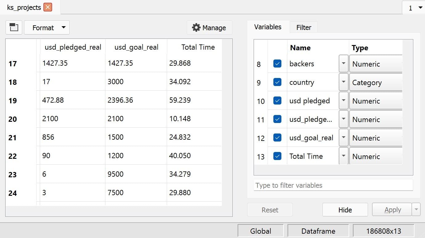
ks_projects = ks_projects ~ asDF(total_days, "Total Time");When we open ks_projects in the Symbol Editor, we now see our new variable, Total Time, and its type listed in the variable list.
Getting to Know Our Data
Now that we've performed some preliminary data cleaning steps, it's time to get to know our data better with some simple data exploration.
Summary Statistics
Quick summary statistics give us insight into our data and can be helpful for finding outliers and other data abnormalities.
The dstatmt procedure allows us to compute descriptive statistics in a single line. It computes the following statistics:
- Mean
- Standard deviation
- Variance
- Minimum
- Maximum
- Valid cases
- Missing cases
There are a few things to note about the dstatmt procedure:
- Only the valid and missing observations are computed for string variables.
- Mean, Std Dev, and Variance are not computed for categorical variables. However, the minimum and maximum observations are computed based on the underlying key values.
Let's look at the summary statistics for our ks_projects data:
// Compute summary statistics
call dstatmt(ks_projects);
------------------------------------------------------------------------------------------------- Variable Mean Std Dev Variance Minimum Maximum Valid Missing ------------------------------------------------------------------------------------------------- ID 1.075e+09 6.189e+08 3.831e+17 1.852e+04 2.147e+09 186808 0 name ----- ----- ----- ----- ----- 186807 1 category ----- ----- ----- ----- ----- 186808 0 main_category ----- ----- ----- Art Theater 186808 0 deadline ----- ----- ----- 2015-01-05 2018-03-03 186808 0 launched ----- ----- ----- 2015-01-01 2018-01-02 186808 0 pledged 1.192e+04 1.167e+05 1.361e+10 0 2.034e+07 186808 0 state ----- ----- ----- canceled undefined 186808 0 backers 114.1 1029 1.06e+06 0 2.194e+05 186808 0 country ----- ----- ----- AT US 186808 0 usd pledged 6423 8.693e+04 7.557e+09 0 2.034e+07 183780 3028 usd_pledged_real 1.054e+04 1.084e+05 1.176e+10 0 2.034e+07 186808 0 usd_goal_real 6.052e+04 1.429e+06 2.041e+12 0.49 1.514e+08 186808 0 Total Time 32.71 11.61 134.7 0.005058 89.57 186808 0
One of the first things that stands out from these descriptive statistics is that there are a lot of missing observations of usd_pledged.
One solution for this, is to use usd_pledged_real and drop the usd_pledged_variable using the delcols procedure:
// Eliminate usd_pledged column
// because of excess missing values
ks_projects = delcols(ks_projects, "usd pledged");
Statistics by Groups
Now, let's see how the mean of the variable usd_pledged_real varies across the variable main_category using the aggregate procedure.
// Find mean of `usd_pledged_real` across `main_category`
aggregate(ks_projects[., "main_category" "usd_pledged_real"], "mean");
main_category usd_pledged_real
Art 3472.4776
Comics 6507.6264
Crafts 1692.6939
Dance 3344.5054
Design 27245.928
Fashion 5906.9240
Film & Video 6065.4645
Food 4736.2799
Games 21032.577
Journalism 2403.8985
Music 3767.5486
Photography 4571.2224
Publishing 3792.7673
Technology 20029.666
Theater 3886.6224
This is useful and we can see that there are clear differences in the mean amount pledged across project categories. However, it may be easier to see these differences if we sort our results using sortc:
// Sort aggregated data based on its second column,
sortc(aggregate(ks_projects[., "main_category" "usd_pledged_real"], "mean"), 2);
main_category usd_pledged_real
Crafts 1692.6939
Journalism 2403.8985
Dance 3344.5054
Art 3472.4776
Music 3767.5486
Publishing 3792.7673
Theater 3886.6224
Photography 4571.2224
Food 4736.2799
Fashion 5906.9240
Film & Video 6065.4645
Comics 6507.6264
Technology 20029.666
Games 21032.577
Design 27245.928
Now we can clearly see that the mean pledged amount is the lowest for Craft projects and is the largest for Design projects.
Exploring our Data with Visualizations
Data visualizations are one of the most powerful tools for preliminary data exploration. They can help us:
- Identify outliers and abnormalities in data.
- Find relationships between variables.
- Identify time-series dynamics.
All of these provide insights that can help guide modeling.
Unlike publication graphics, preliminary data visualizations for exploration don't need much custom formatting and annotation. Instead, it is more important that we can make quick and clear plots.
In GAUSS 22, plots were enhanced with intelligent graph attributes which make data visualization substantially easier and more useful, including:
- The ability to specify variables to plot by name with convenient formula strings.
- Automatic use of variable names and category labels.
- Data splitting using the new
bykeyword.
For example, let's see how the usd_pledged_real is related to the Total Time variable that we created using a scatter plot:
// Create scatter plot of `usd_pledged_real` against `Total Time`
plotScatter(ks_projects, "usd_pledged_real ~ Total Time");
Our plot provides some quick data insights:
- The majority of campaigns are between 0-60 days in length.
- There appear to be clusters of campaigns around approximately 30, 45, and 60 days in length.
- There doesn't appear to be much of a correlation between campaign length and pledged dollars.
- The majority of campaigns earned less than 3e+06 and there are a lot of campaigns that didn't receive any pledges.
Based on the last observation, it might be useful to:
- Filter out the observations that received no pledges (we won't address the topic of truncated data here and I'm not suggesting that this is in general a good modeling step)
// Filter out observations with no pledges
ks_projects = selif(ks_projects, (ks_projects[., "usd_pledged_real"] .!= 0));- Look at the percentiles
usd_pledged_realusing thequantileprocedure:
// Create sequence of percentiles
e = seqa(0.1, .1, 10);

// Compute quantiles
quantile(ks_projects[., "usd_pledged_real"], e);
quantile usd_pledged_real
0.1 12.000000
0.2 51.720000
0.3 151.00000
0.4 390.60800
0.5 896.00000
0.6 1868.1440
0.7 3664.7240
0.8 7442.5860
0.9 18309.240
This is helpful, it tells us that 50% of usd_pledged_real observations fall below about $1,000, 80% fall below about $10,000 and 90% fall below about $19,000.
Given these observations let's look at histogram of the pledges that fall between the 10% and 50%:
// Filter our data to look at
// data between 10% and 50%
ks_projects = selif(ks_projects,
                   (ks_projects[., "usd_pledged_real"] .> 12 .and
                    ks_projects[., "usd_pledged_real"] .< 1000));

// Histogram of remaining data
plotHist(ks_projects[., "usd_pledged_real"], 100); 
Conclusion
Data cleaning is tedious and time-consuming, but we've seen in this blog how the right tools and make it less painful. We've looked at how to efficiently prepare and explore real-world data before modeling or estimation including:
- Loading.
- Cleaning data to eliminate misentries, missing values, and more.
- Exploring data.

Eric has been working to build, distribute, and strengthen the GAUSS universe since 2012. He is an economist skilled in data analysis and software development. He has earned a B.A. and MSc in economics and engineering and has over 18 years of combined industry and academic experience in data analysis and research.